Branding, graphic identity & design for Oriflame’s new hybrid skin care brand Waunt.
Imagery & communication created within the Oriflame studio.
Waunt was created under Oriflame, propelling the company into a new era and reaching a fresh consumer group. The goal was to establish a bolder, more expressive and youthful skin care brand—one that went beyond what the company was previously known for.
I led the strategic and creative process, shaping a brand that continually embraces experimentation and self-expression across packaging, graphic elements, and formulations. Since its launch, Waunt has paved the way for a new wave of innovation within the company’s portfolio.
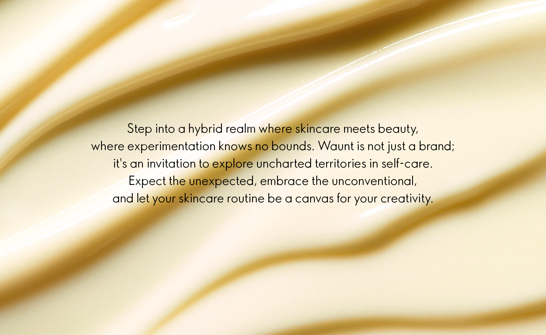
Waunt: Where Fluidity Inspires Design
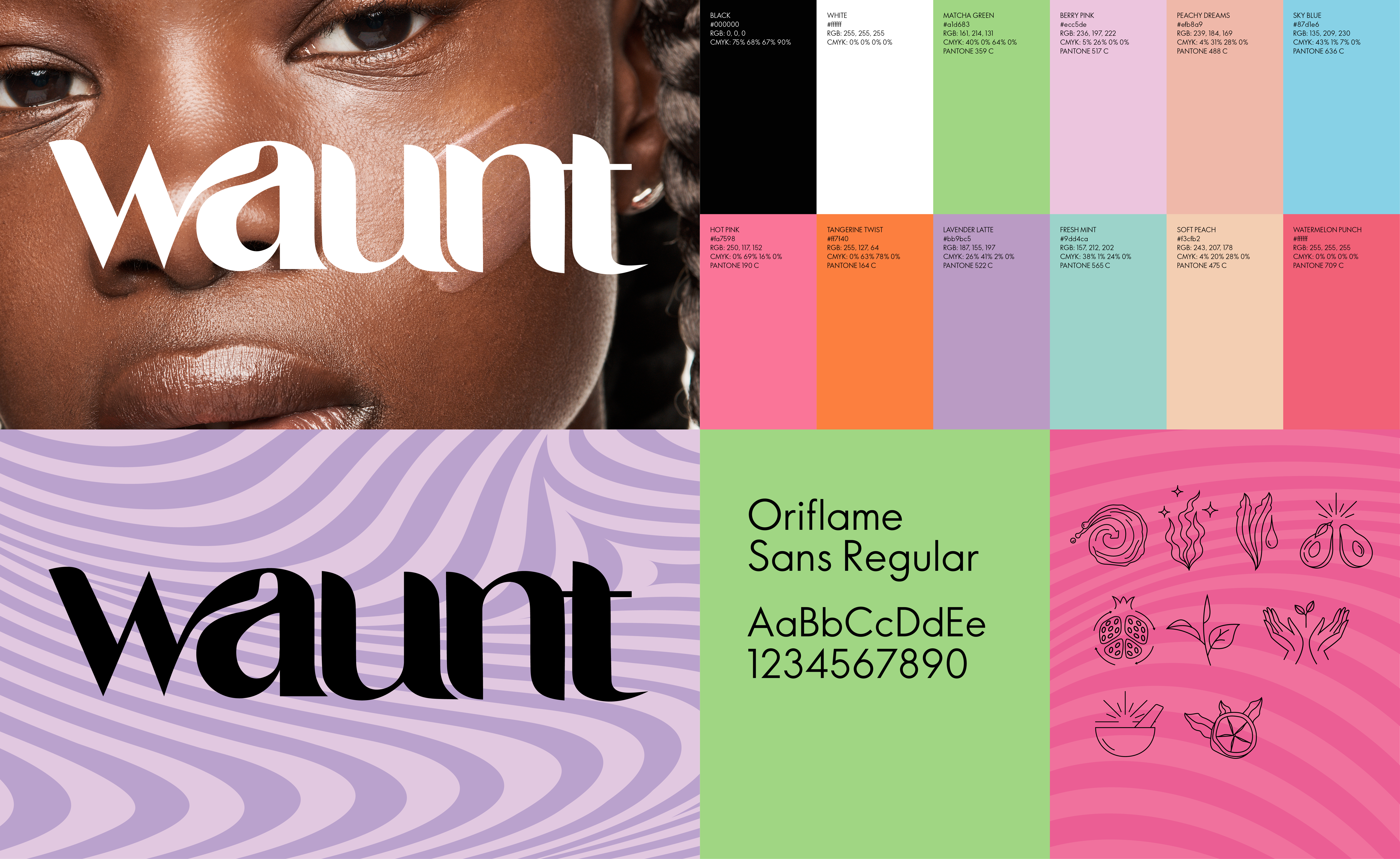
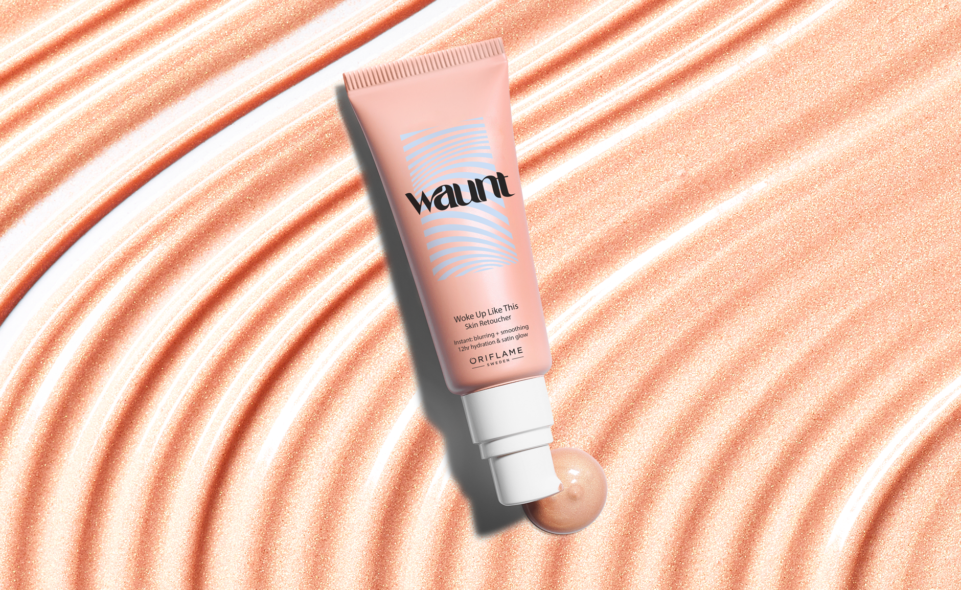
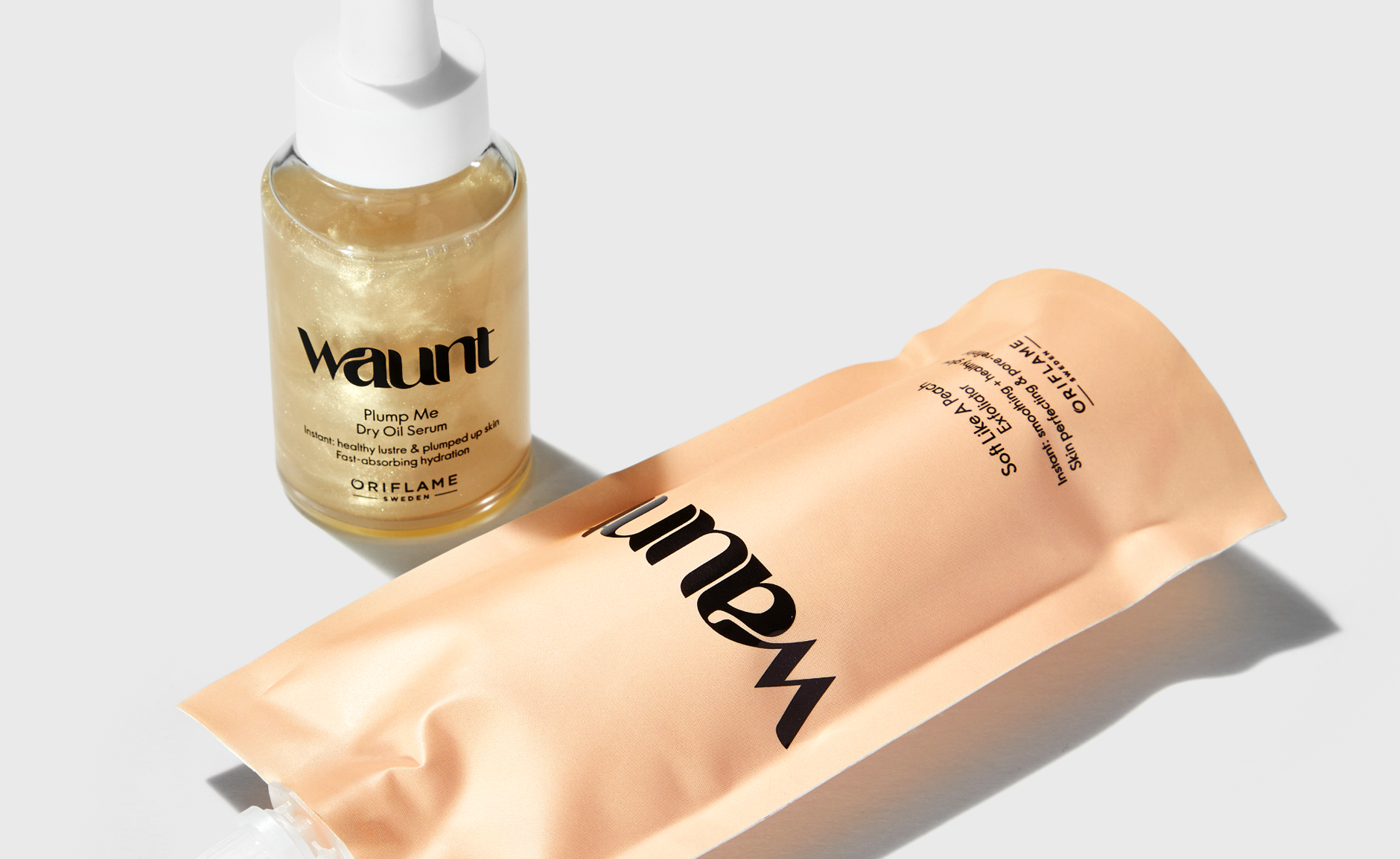
The Waunt logo draws inspiration from the dynamic nature of the brand’s diverse audience, embracing fluidity in terms of genders, identity, and self-expression.
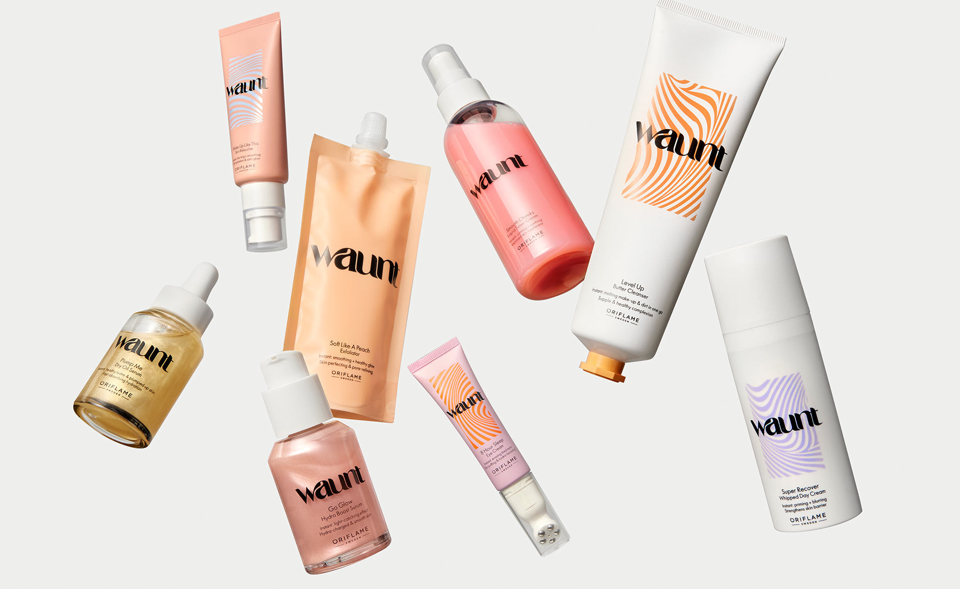
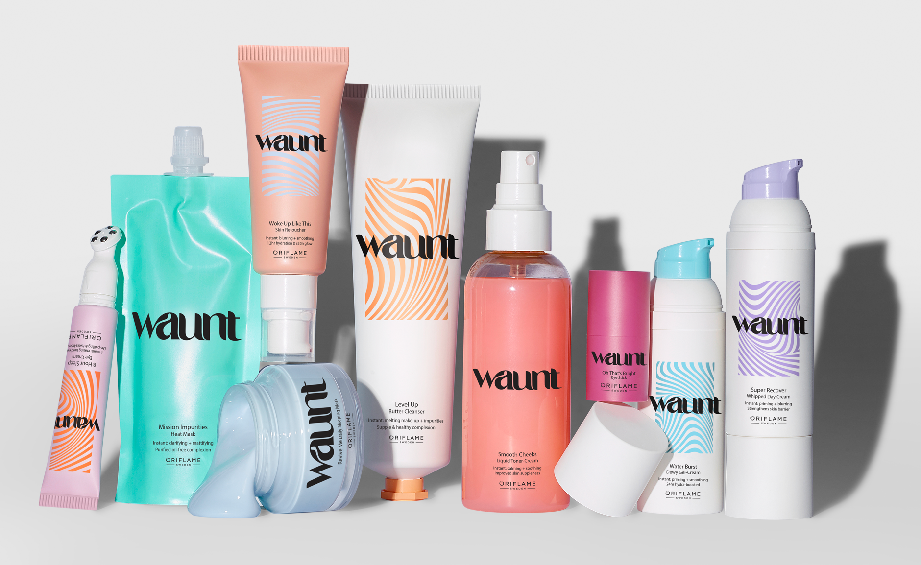
Carefully crafted, the customized logo serves as the inspiration for an additional pattern, a vibrant canvas decorating the packaging. Together, they create a narrative of textures and playfulness that defines the essence of the Waunt brand.
In cases where the pattern isn’t applied on primary packaging,
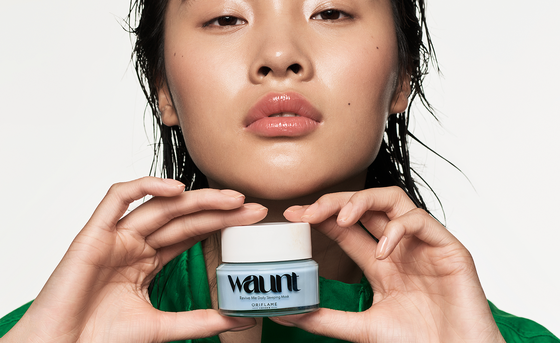
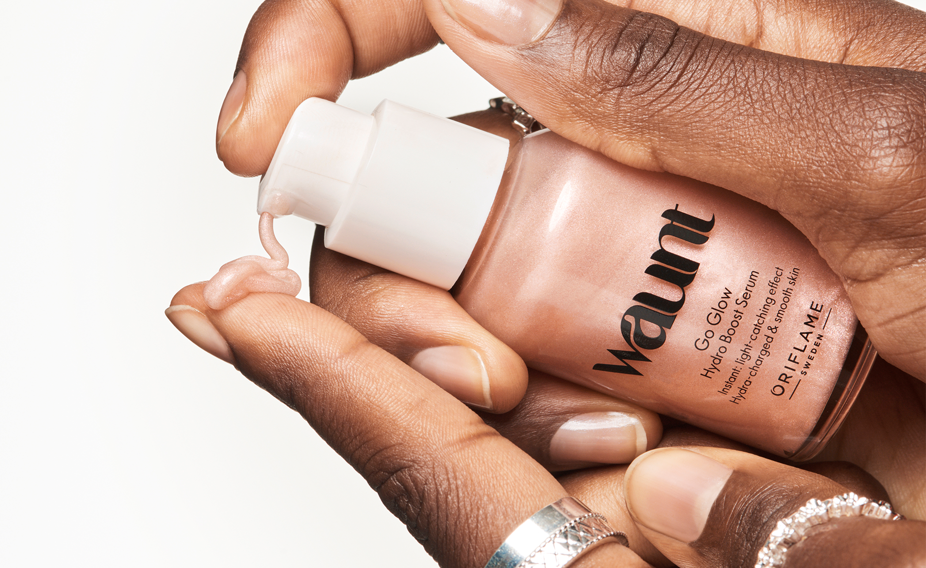
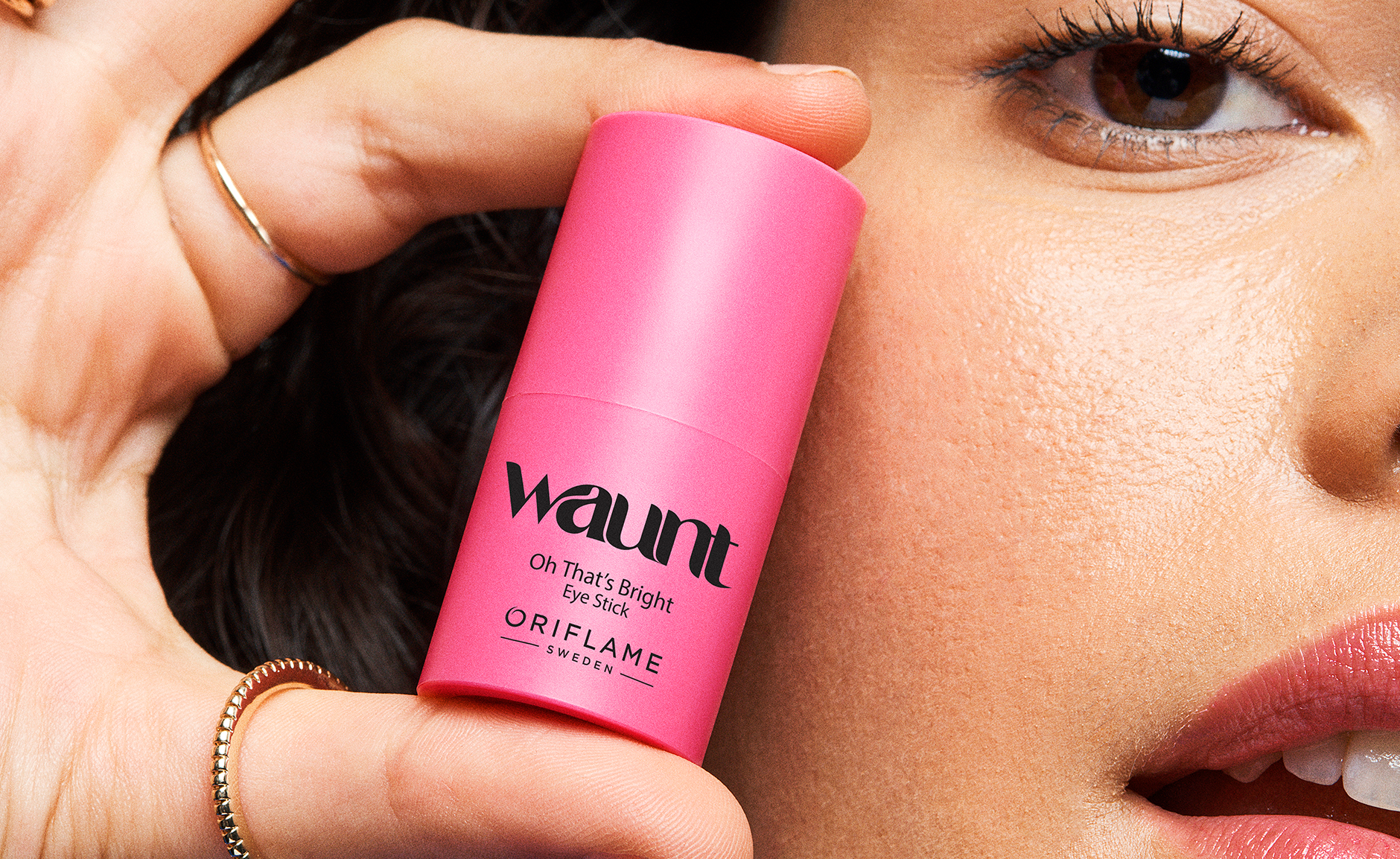
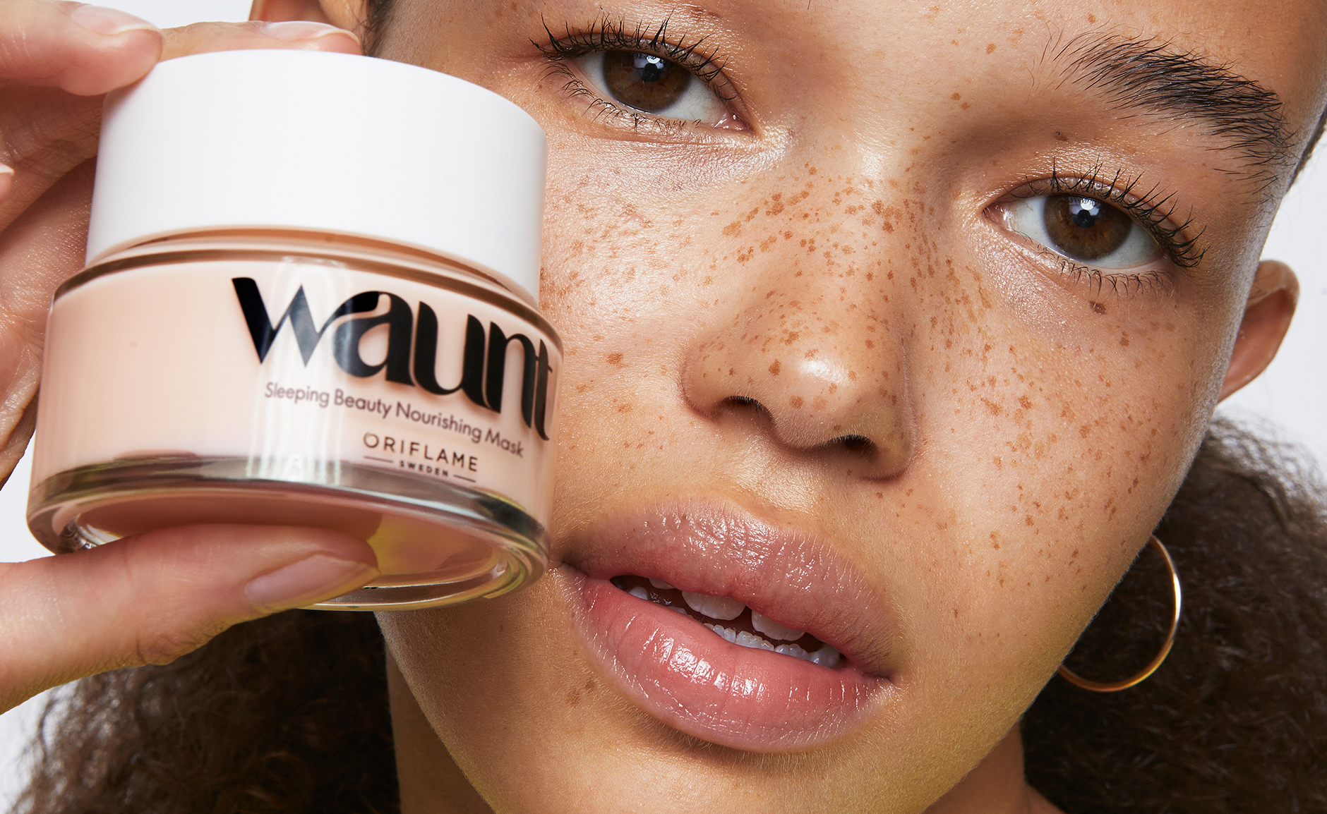
the logo stands independently, its fluidity hinting at the connection to the vibrant patterns that define the identity.
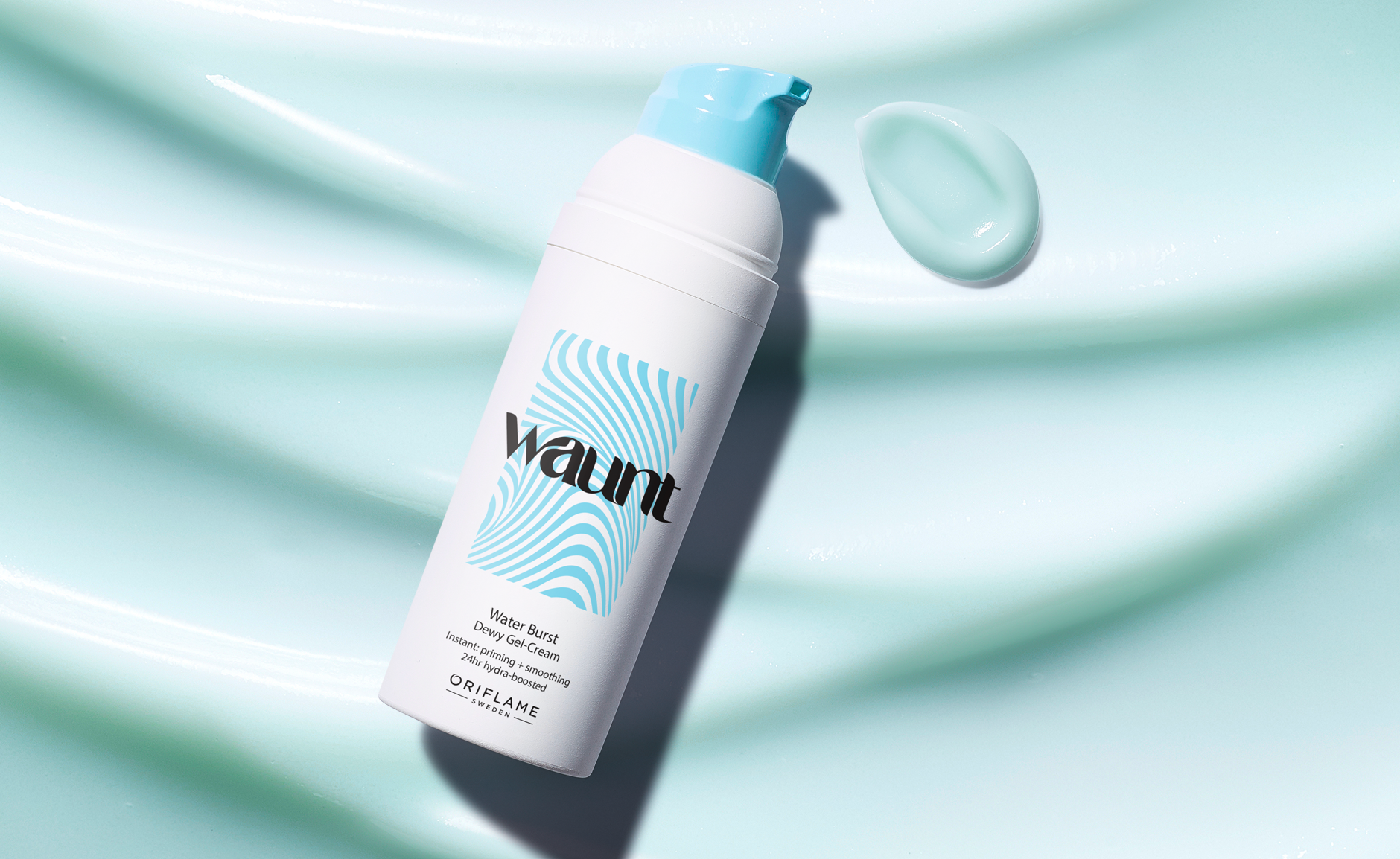
For packaging and overall brand application, the logo is applied in bold black, to translate a sense of strength and contrast against the backdrop of the joyful and vivid color palette. This intentional juxtaposition mirrors the duality within the brand, capturing attention with a bold edge while maintaining the lively spirit that defines Waunt.
Waunt was created under Oriflame, propelling the company into a new era and reaching a fresh consumer group. The goal was to establish a bolder, more expressive and youthful skin care brand—one that went beyond what the company was previously known for.
I led the strategic and creative process, shaping a brand that continually embraces experimentation and self-expression across packaging, graphic elements, and formulations. Since its launch, Waunt has paved the way for a new wave of innovation within the company’s portfolio.
Waunt: Where Fluidity Inspires Design
The Waunt logo draws inspiration from the dynamic nature of the brand’s diverse audience, embracing fluidity in terms of genders, identity, and self-expression.
Carefully crafted, the customized logo serves as the inspiration for an additional pattern, a vibrant canvas decorating the packaging. Together, they create a narrative of textures and playfulness that defines the essence of the Waunt brand.
In cases where the pattern isn’t applied on primary packaging,
the logo stands independently, its fluidity hinting at the connection to the vibrant patterns that define the identity.
For packaging and overall brand application, the logo is applied in bold black, to translate a sense of strength and contrast against the backdrop of the joyful and vivid color palette. This intentional juxtaposition mirrors the duality within the brand, capturing attention with a bold edge while maintaining the lively spirit that defines Waunt.
Waunt
2022
2022