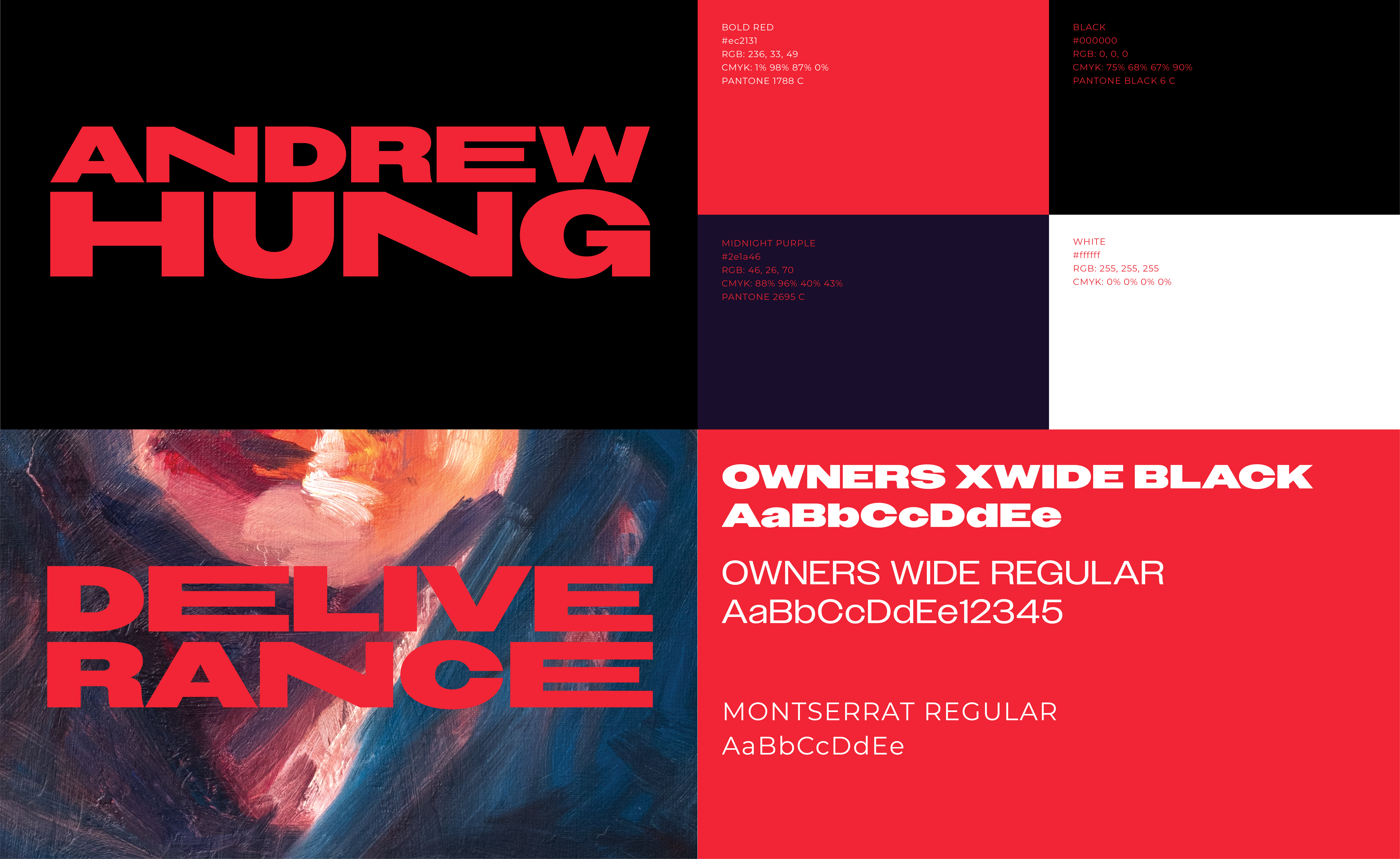
Concept, design & layout for Andrew Hung’s new album Deliverance. Vinyl & CD.
Portrait made by Andrew Hung.
Andrew Hung is a British musician, songwriter, and producer based in London. With the release of his album Deliverance, he continues to embody his punk ethos by writing, performing, producing, and mixing the entire album himself. Commissioned by Andrew and his record label, Lex Records, I designed the concept and layout for both the vinyl and CD, drawing inspiration from his journey of self-discovery and empowerment.
“Deliverance,” captures liberation and the profound journey of self-transformation, leading to the discovery of a new identity and mode of expression.
The album’s design and concept stem from this powerful narrative, symbolizing the act of breaking free from a previous identity and finding one’s true self.
Bold, elongated lettering embodies this metamorphosis, claiming the space with unapologetic confidence. Inspired by Andrew Hung’s own portrait, the design features a vivid, dramatic color palette, mirroring the intensity of his musical expression.
With increased boldness and confidence, the album asserts its presence alongside Andrew’s stirring soundscapes, inviting listeners into a realm where identity ignites boundless creativity.
Lex Records x Andrew Hung
2023
2023


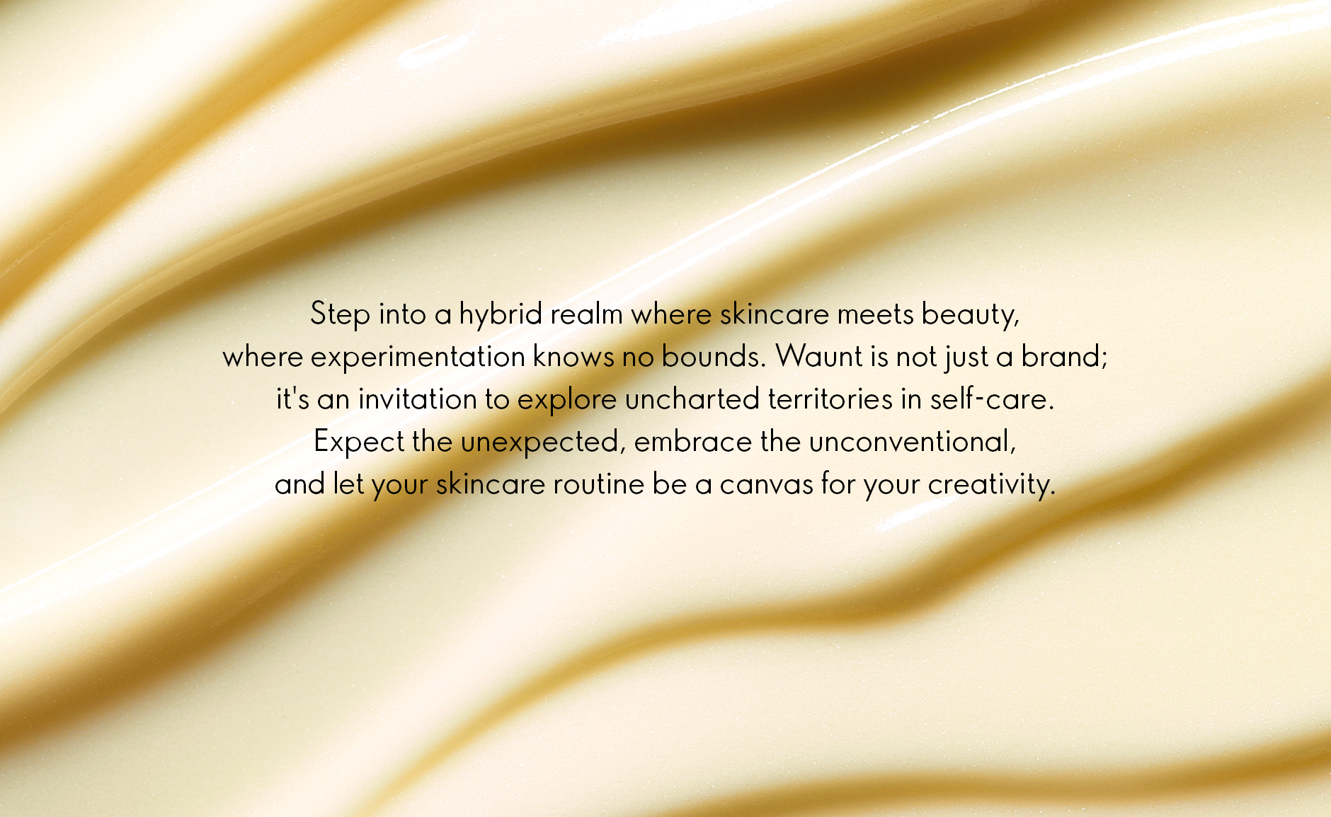
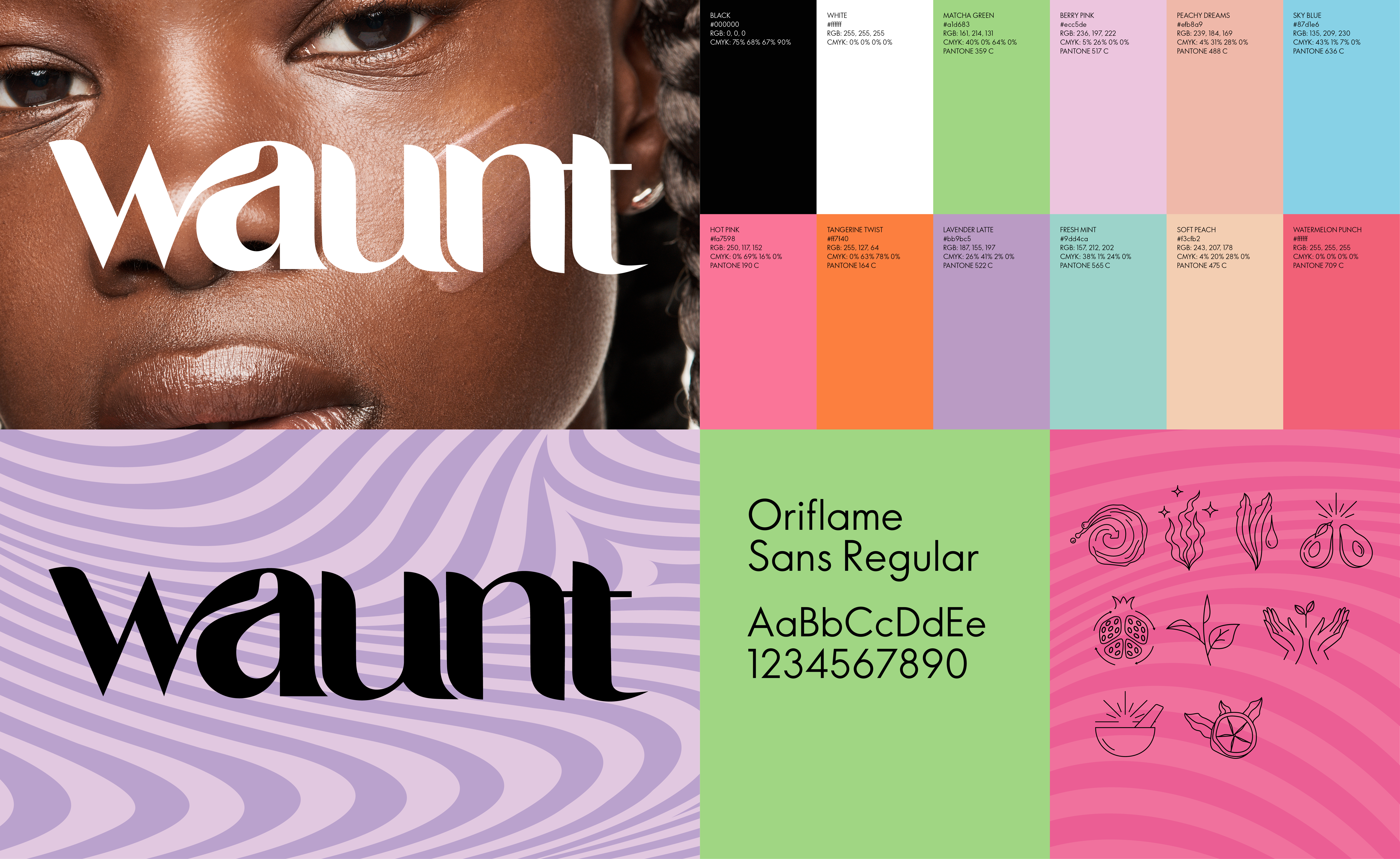
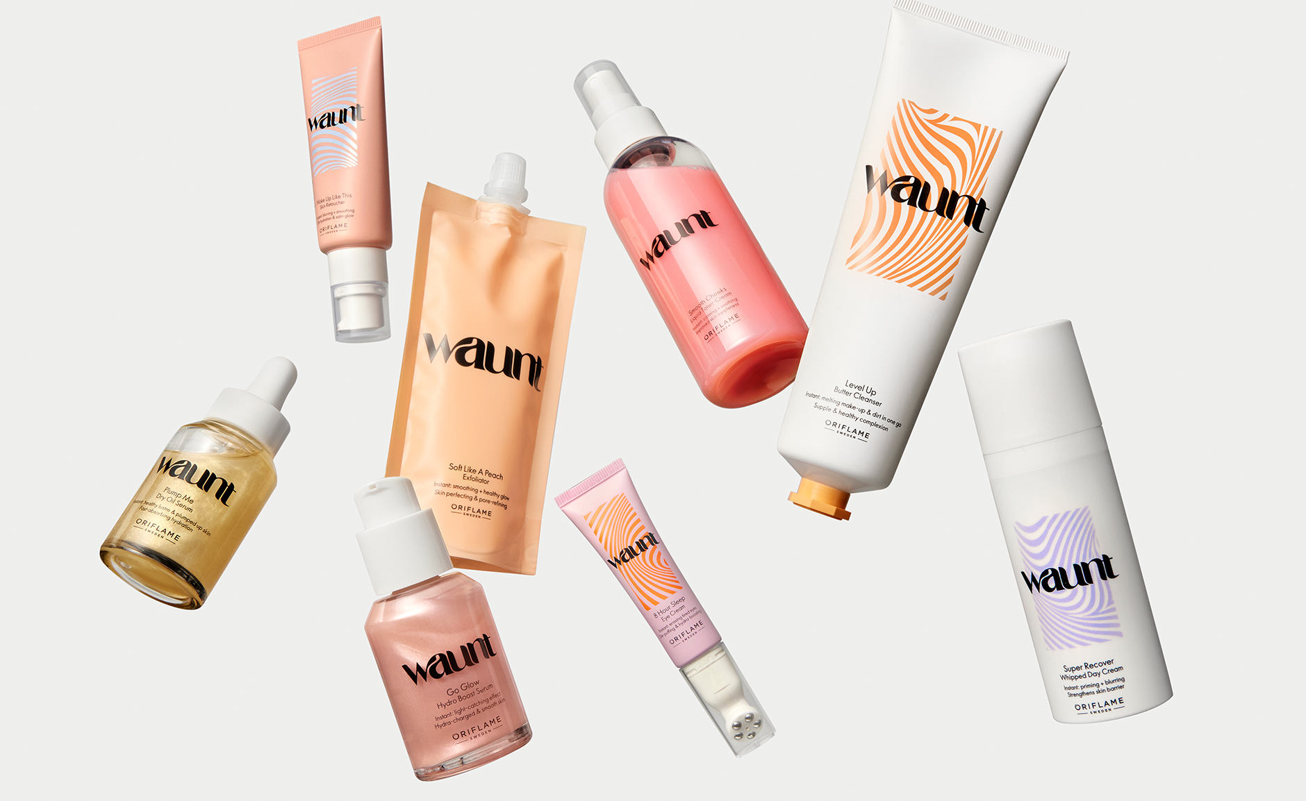
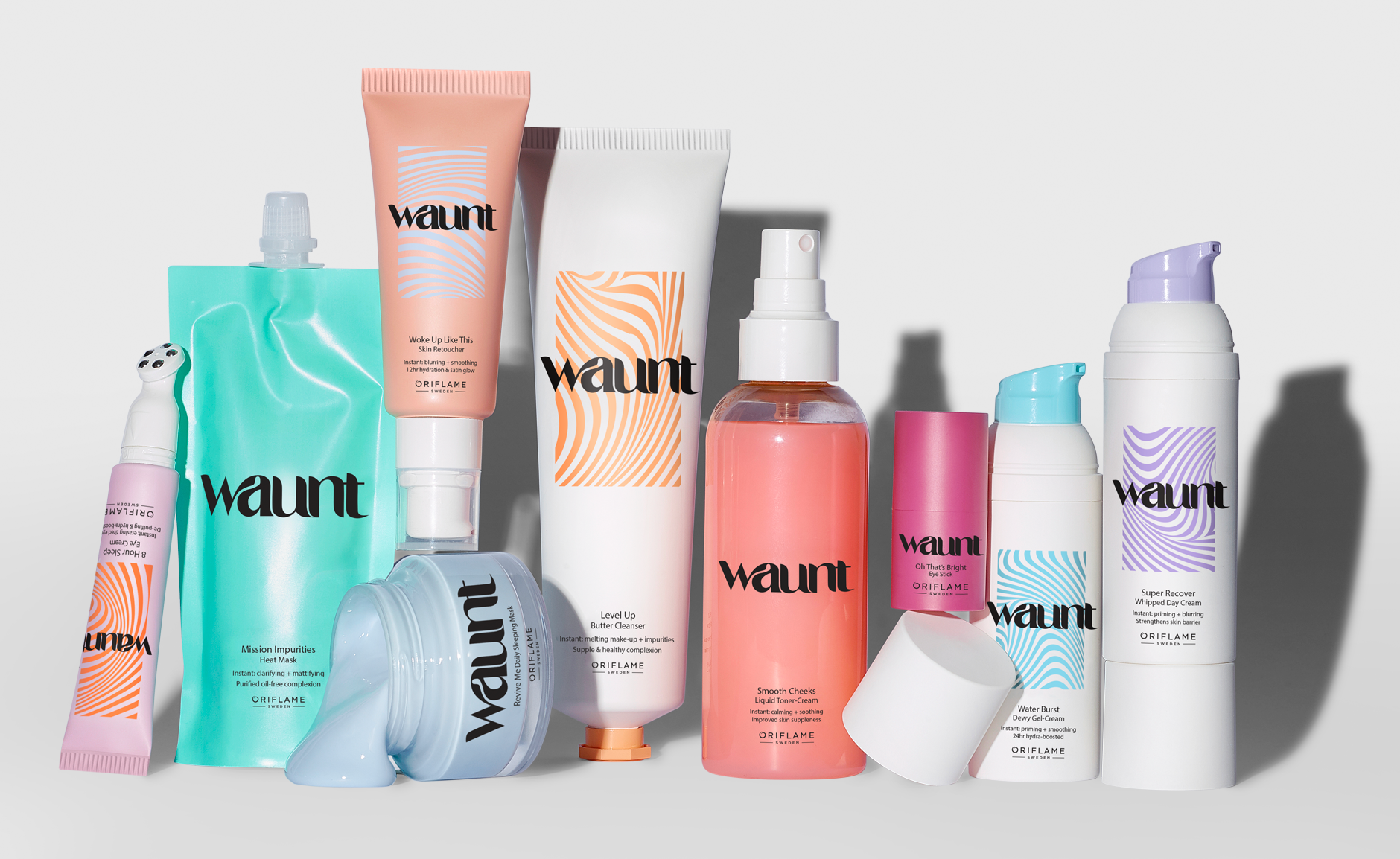
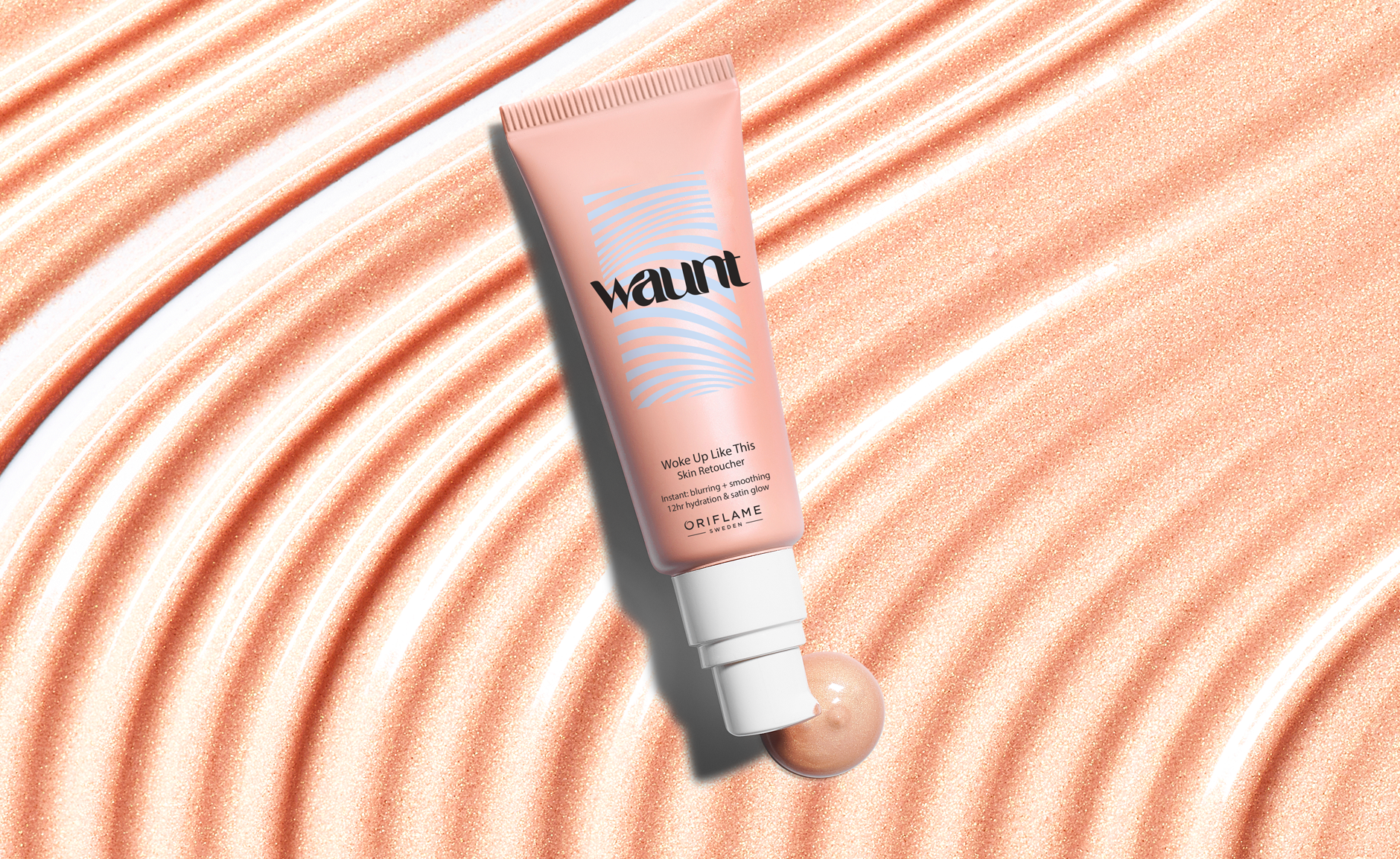
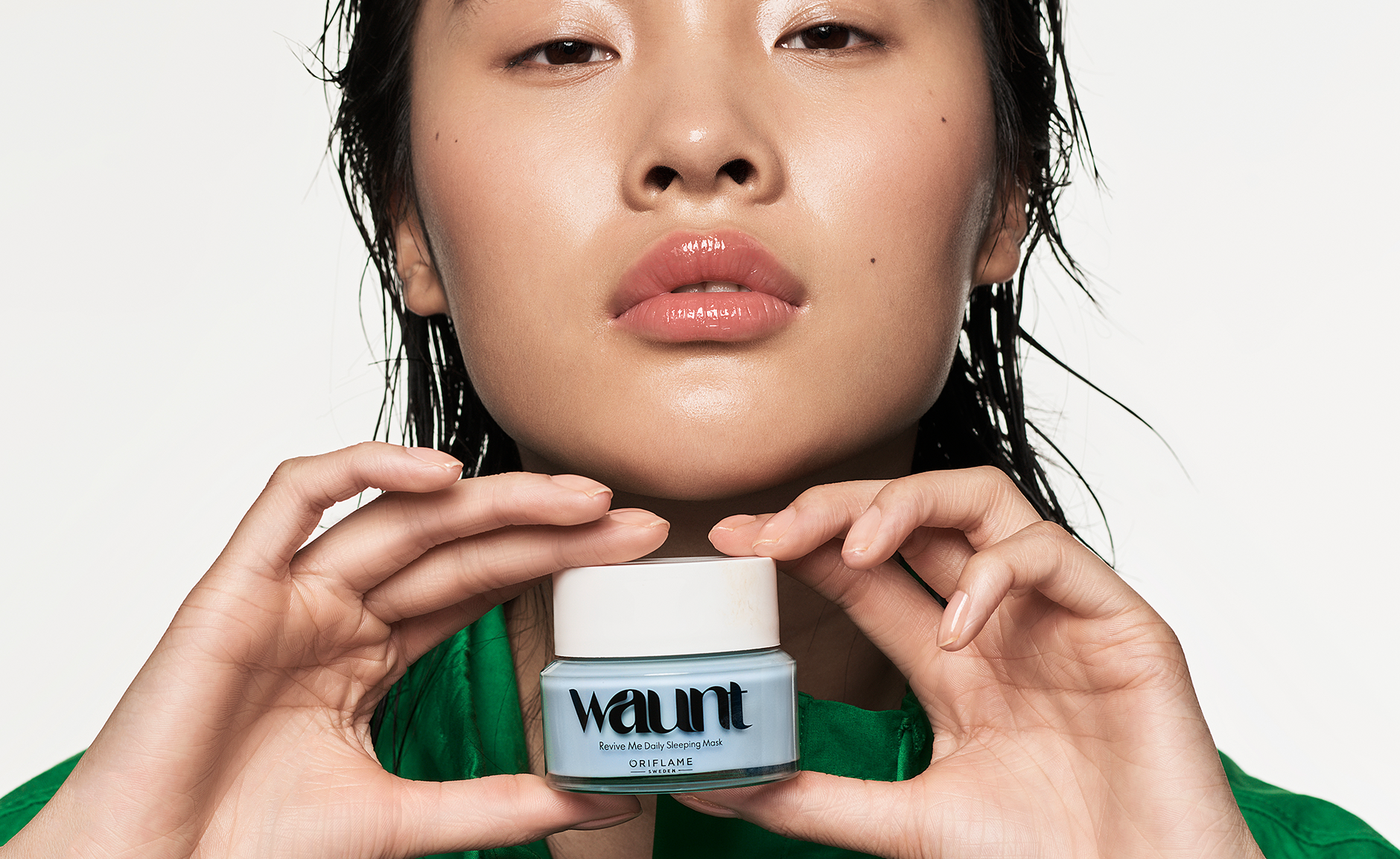
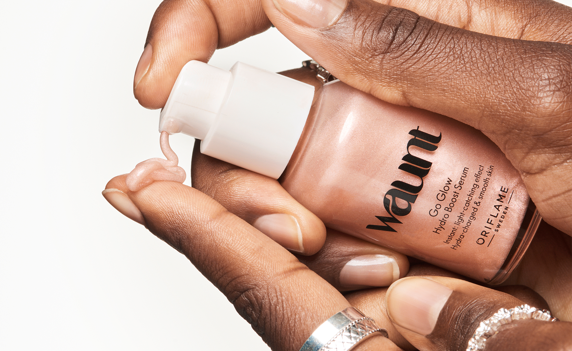
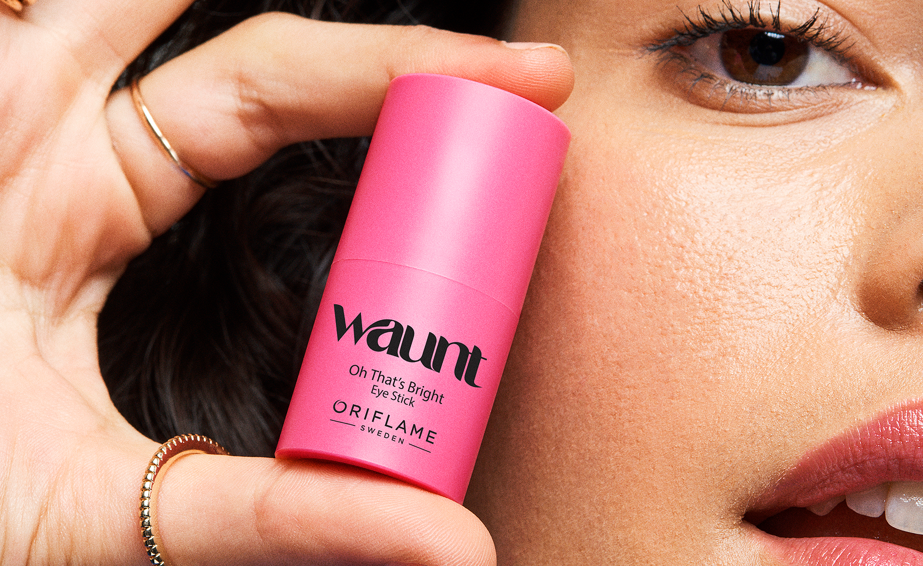
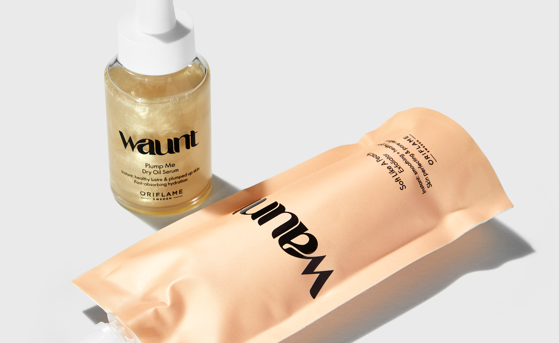
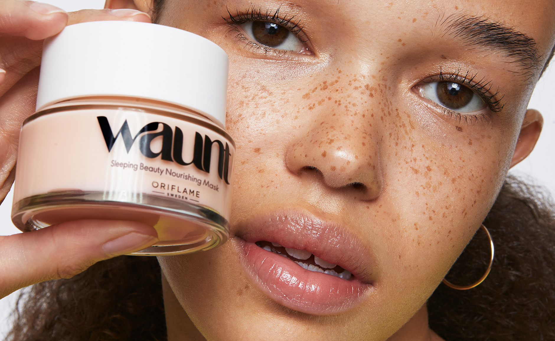
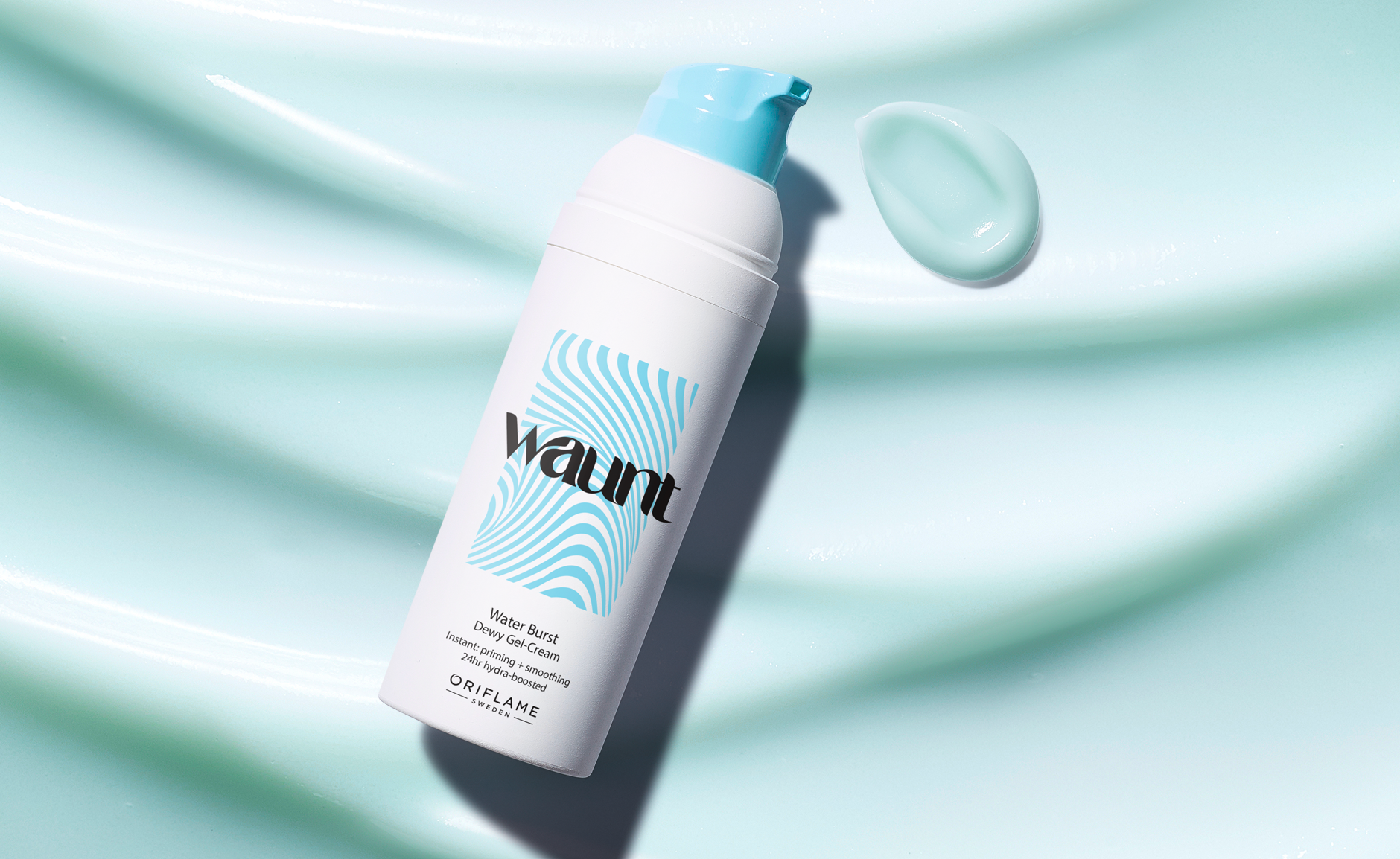
Branding, graphic identity & design for Oriflame’s new hybrid skin care brand Waunt.
Imagery & communication created within the Oriflame studio.
Waunt was created under Oriflame, propelling the company into a new era and reaching a fresh consumer group. The goal was to establish a bolder, more expressive and youthful skin care brand—one that went beyond what the company was previously known for.
I led the strategic and creative process, shaping a brand that continually embraces experimentation and self-expression across packaging, graphic elements, and formulations. Since its launch, Waunt has paved the way for a new wave of innovation within the company’s portfolio.
Waunt: Where Fluidity Inspires Design
The Waunt logo draws inspiration from the dynamic nature of the brand’s diverse audience, embracing fluidity in terms of genders, identity, and self-expression.
Carefully crafted, the customized logo serves as the inspiration for an additional pattern, a vibrant canvas decorating the packaging. Together, they create a narrative of textures and playfulness that defines the essence of the Waunt brand.
In cases where the pattern isn’t applied on primary packaging,
the logo stands independently, its fluidity hinting at the connection to the vibrant patterns that define the identity.
For packaging and overall brand application, the logo is applied in bold black, to translate a sense of strength and contrast against the backdrop of the joyful and vivid color palette. This intentional juxtaposition mirrors the duality within the brand, capturing attention with a bold edge while maintaining the lively spirit that defines Waunt.
Waunt
2022
2022


Rebranding of female intimate care brand
Feminelle, under Oriflame. Updated design, labels, logo, bottle & expression.
Feminelle: Where Confidence Meets Care
Feminelle is a well-established intimate care brand under Oriflame. Moving the brand into 2025, I was commissioned as a creative lead and designer to find a suitable strategic place for the brand visually.
The goal was to educate and destigmatize intimate care, especially in conservative regions, by highlighting the products’ ingredients and functionality in a contemporary way, without causing shame or need to hide the products.
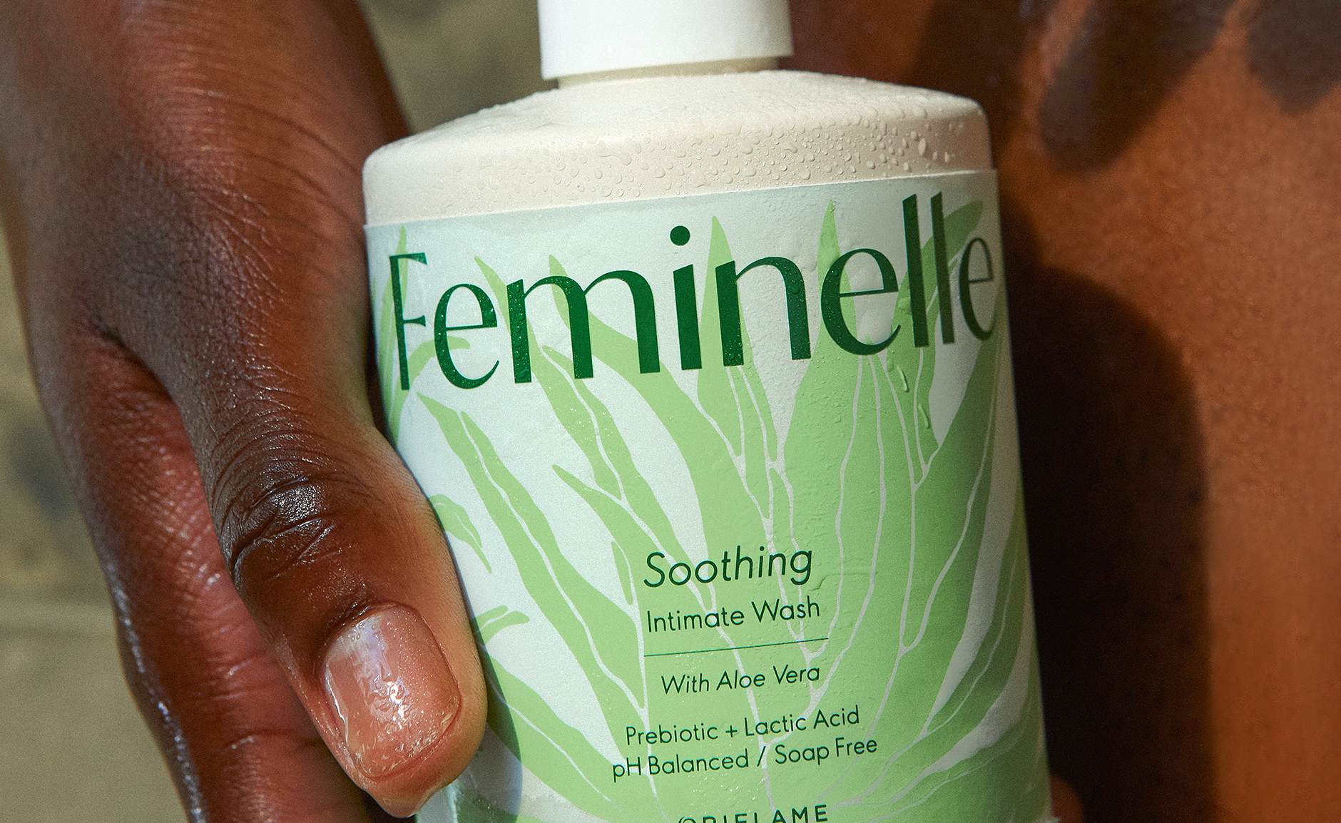
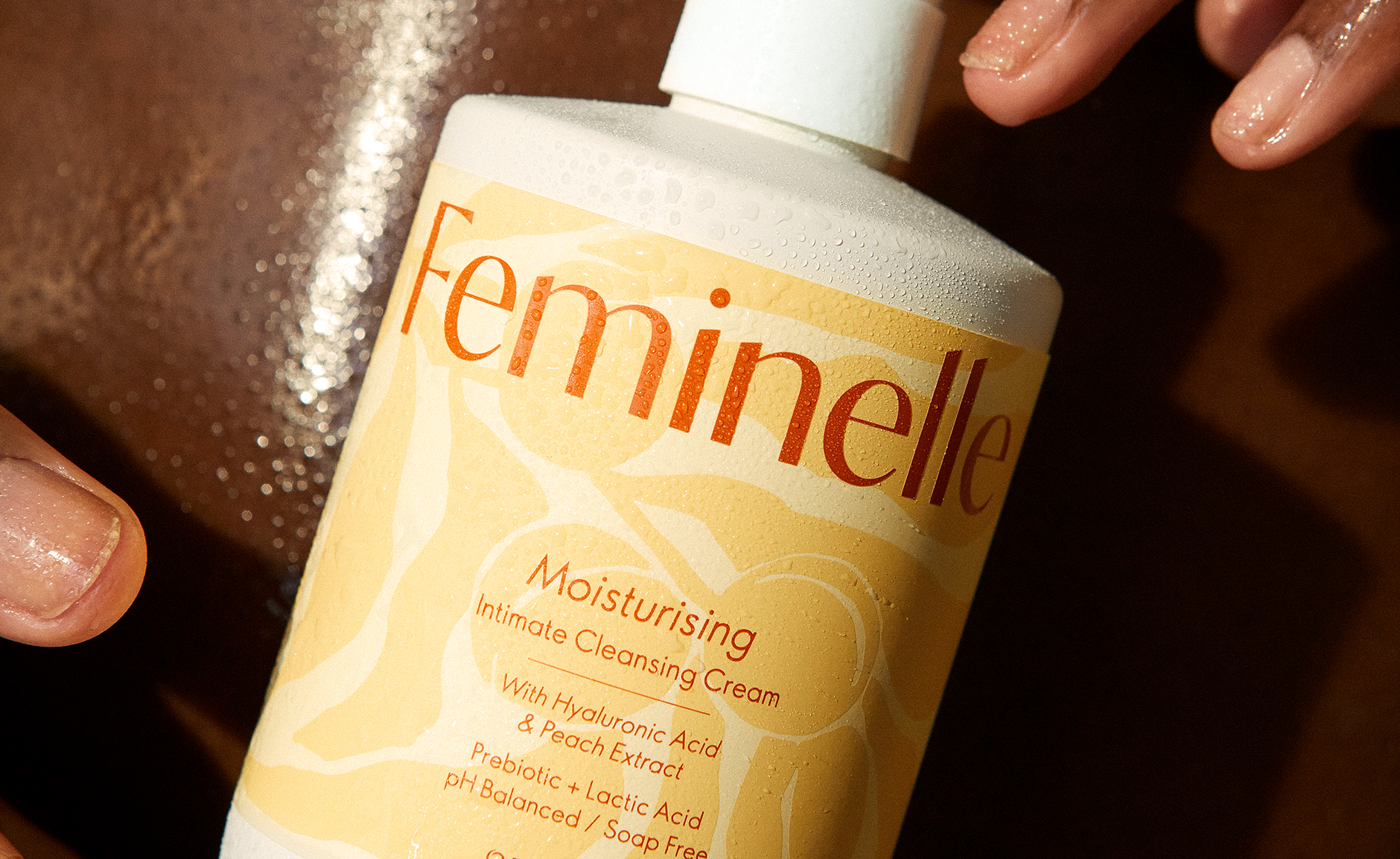
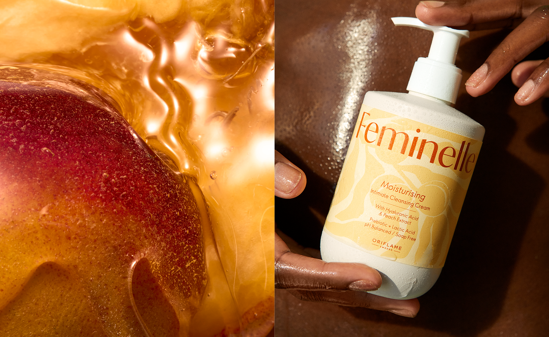
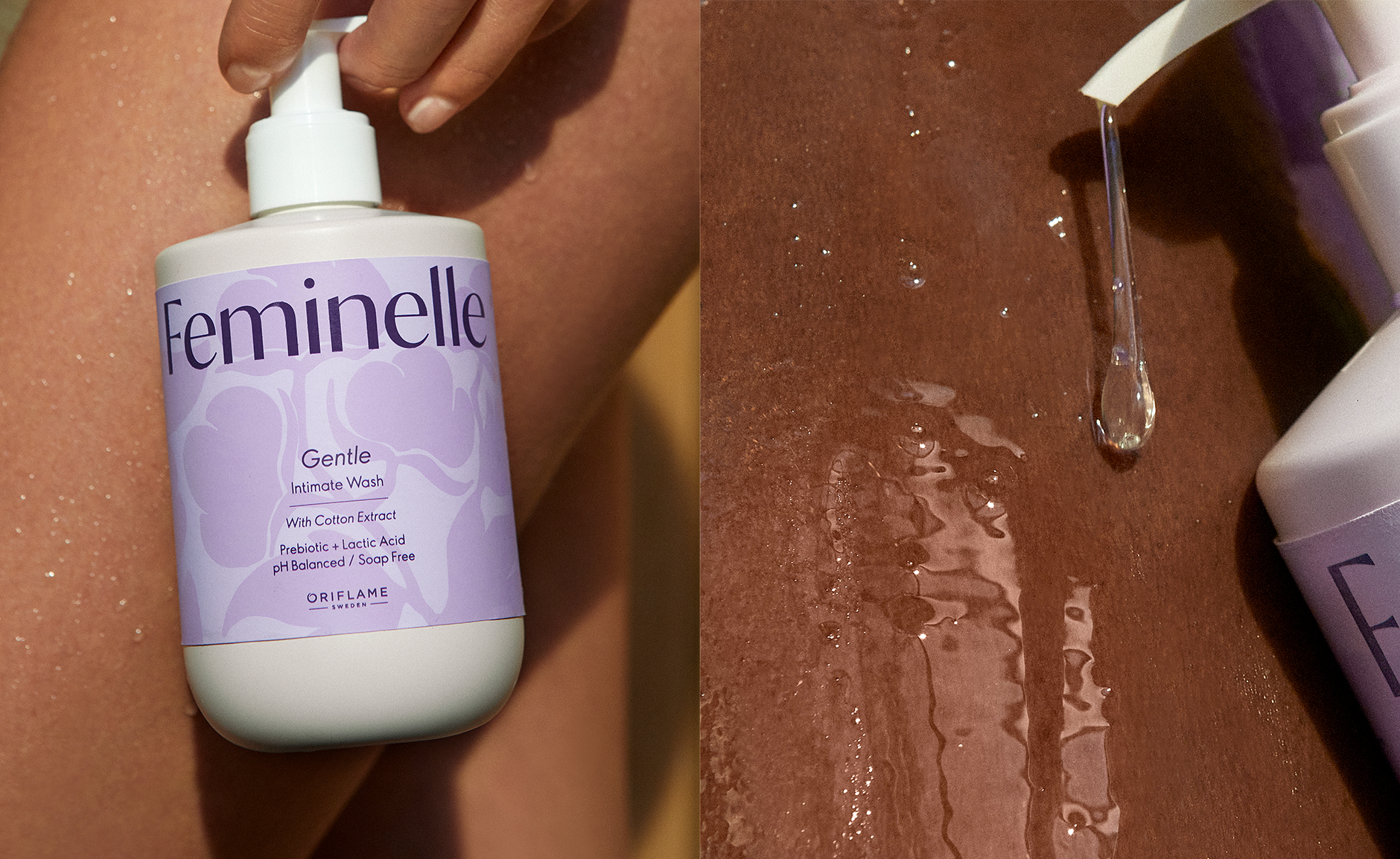
The previous bottle has been replaced with a new, current shape that communicates a kind, soft and clean approach. Inspired by the female body, it has a rounded and soft shape with proud shoulders, combining strength and grace.
Applied in a warmer white, it communicates the cleanness of the products but not as harsh as the usage of clinical white.
The labels feature a velvety texture with hand-drawn, modern ingredient patterns, adding a caring touch. This redesign transforms the ingredients from a graphic, stale look to an artistic display, making the products something to proudly show off, free from taboo.
The logo was reimagined to reflect the brand’s new direction. The previous romantic, traditional design has been replaced with a contemporary logo that exudes confidence and clarity, while retaining rounded shapes in the typography for added warmth.
This new logo balances modernity with approachability, positioning Feminelle as a brand that fosters confidence and openness.
Feminelle: Where Confidence Meets Care
Feminelle is a well-established intimate care brand under Oriflame. Moving the brand into 2025, I was commissioned as a creative lead and designer to find a suitable strategic place for the brand visually.
The goal was to educate and destigmatize intimate care, especially in conservative regions, by highlighting the products’ ingredients and functionality in a contemporary way, without causing shame or need to hide the products.
The previous bottle has been replaced with a new, current shape that communicates a kind, soft and clean approach. Inspired by the female body, it has a rounded and soft shape with proud shoulders, combining strength and grace.
Applied in a warmer white, it communicates the cleanness of the products but not as harsh as the usage of clinical white.
The labels feature a velvety texture with hand-drawn, modern ingredient patterns, adding a caring touch. This redesign transforms the ingredients from a graphic, stale look to an artistic display, making the products something to proudly show off, free from taboo.
The logo was reimagined to reflect the brand’s new direction. The previous romantic, traditional design has been replaced with a contemporary logo that exudes confidence and clarity, while retaining rounded shapes in the typography for added warmth.
This new logo balances modernity with approachability, positioning Feminelle as a brand that fosters confidence and openness.
Feminelle
2025
2025


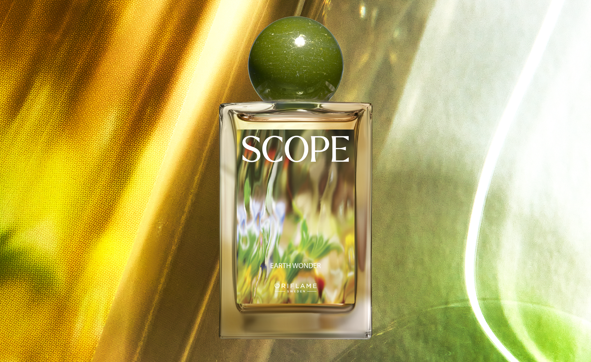
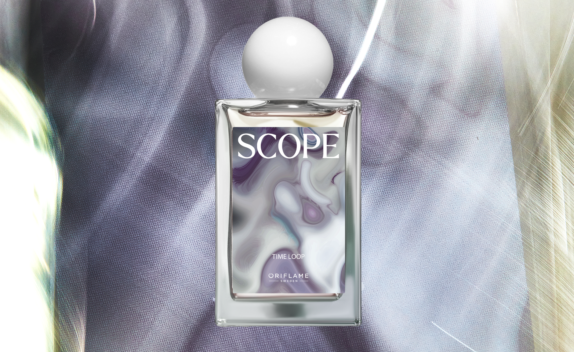
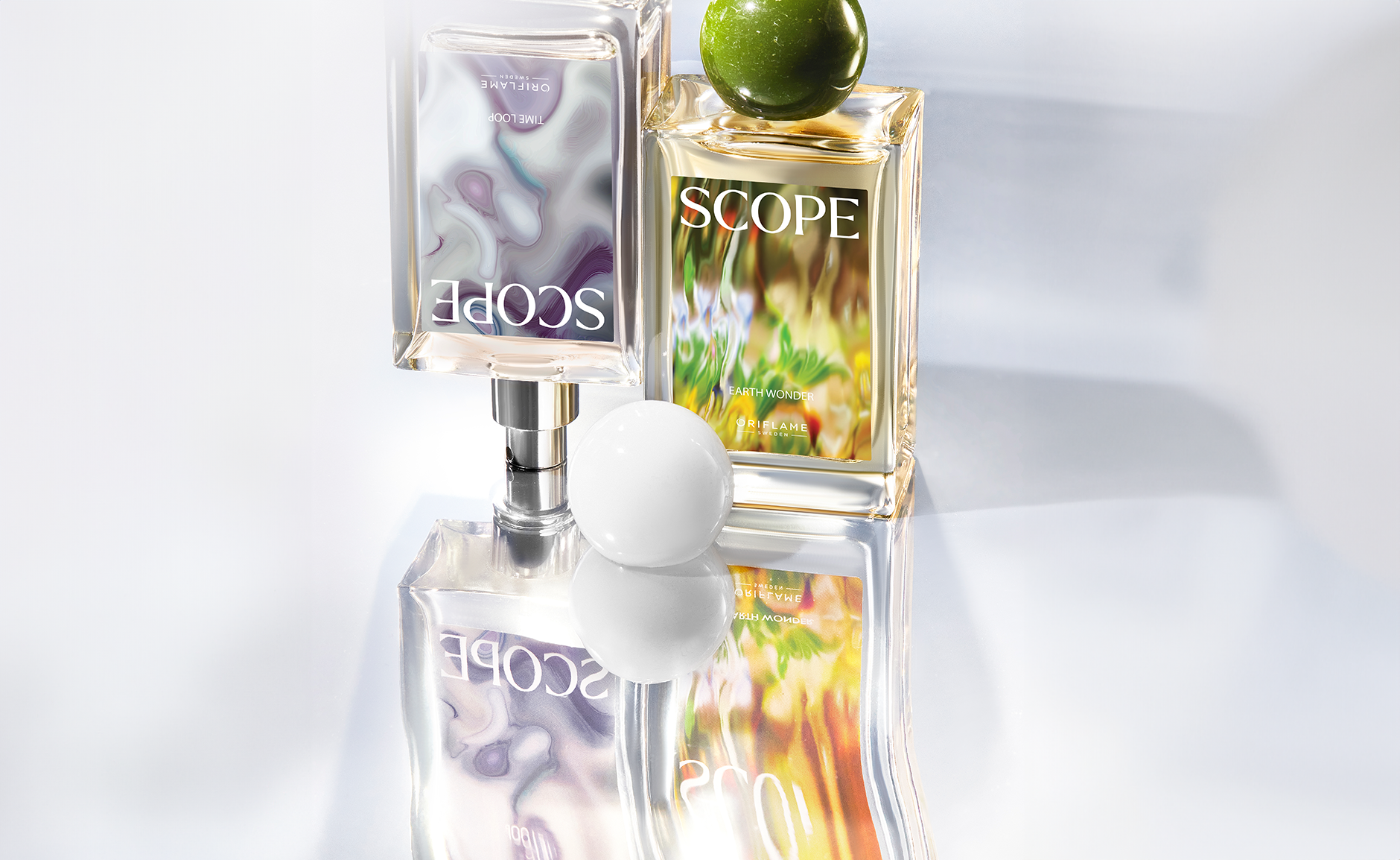
Branding, graphic identity & design for Oriflame’s new Ai fragrance brand SCOPE.
SCOPE: Fragrance Meets AI
With the rise of AI technology, Oriflame ventured into uncharted territory by exploring the creation of fragrance alongside AI. As the lead designer, I conceptualized and developed this idea into the brand SCOPE, offering a platform to explore escapism and the many dimensions of one’s personality.
SCOPE’s mission is to explore different dimensions and unveil the unknown. Each fragrance is visualized through immersive 3D imagery, using illusive filters to symbolize portals between worlds. These visuals are integral to the fragrance experience, transforming each scent into a journey through various realms.
The bottle design is intentionally inclusive, catering to all genders, while the signature globe cap represents and visualizes each separate world.
This thoughtful design element complements the immersive experience, emphasizing the unique realms each fragrance explores.
The logo, designed with contemporary references to claim a distinct territory for our target group, is strategically placed on top, creating a clean contrast to the illusive imagery and giving space for the visual portal that is the image.
Co-created with AI, SCOPE fragrances challenge traditional boundaries, resulting in unique compositions that evoke curiosity and wonder. These innovative scents inspire the design, encouraging exploration and discovery.
SCOPE
2024
2024


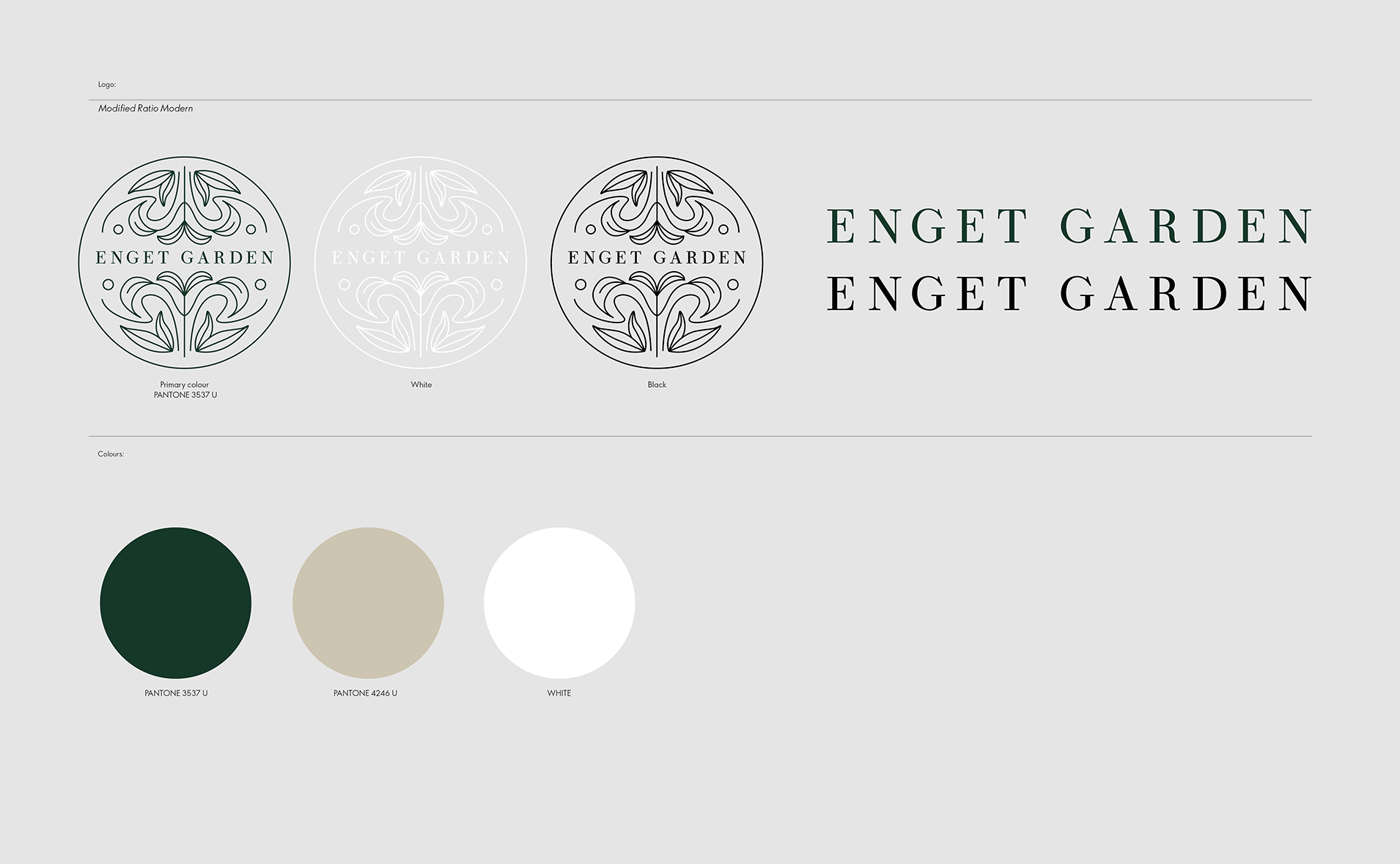
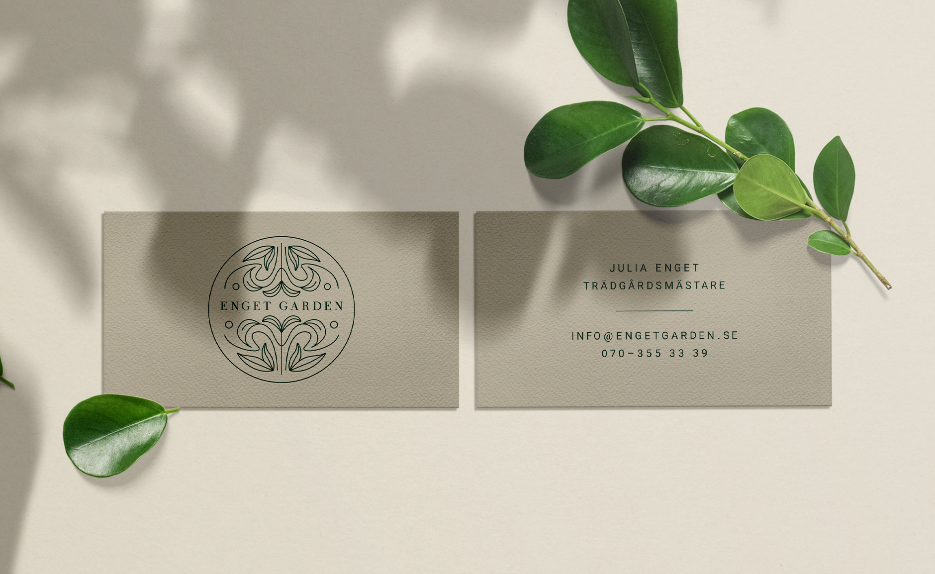
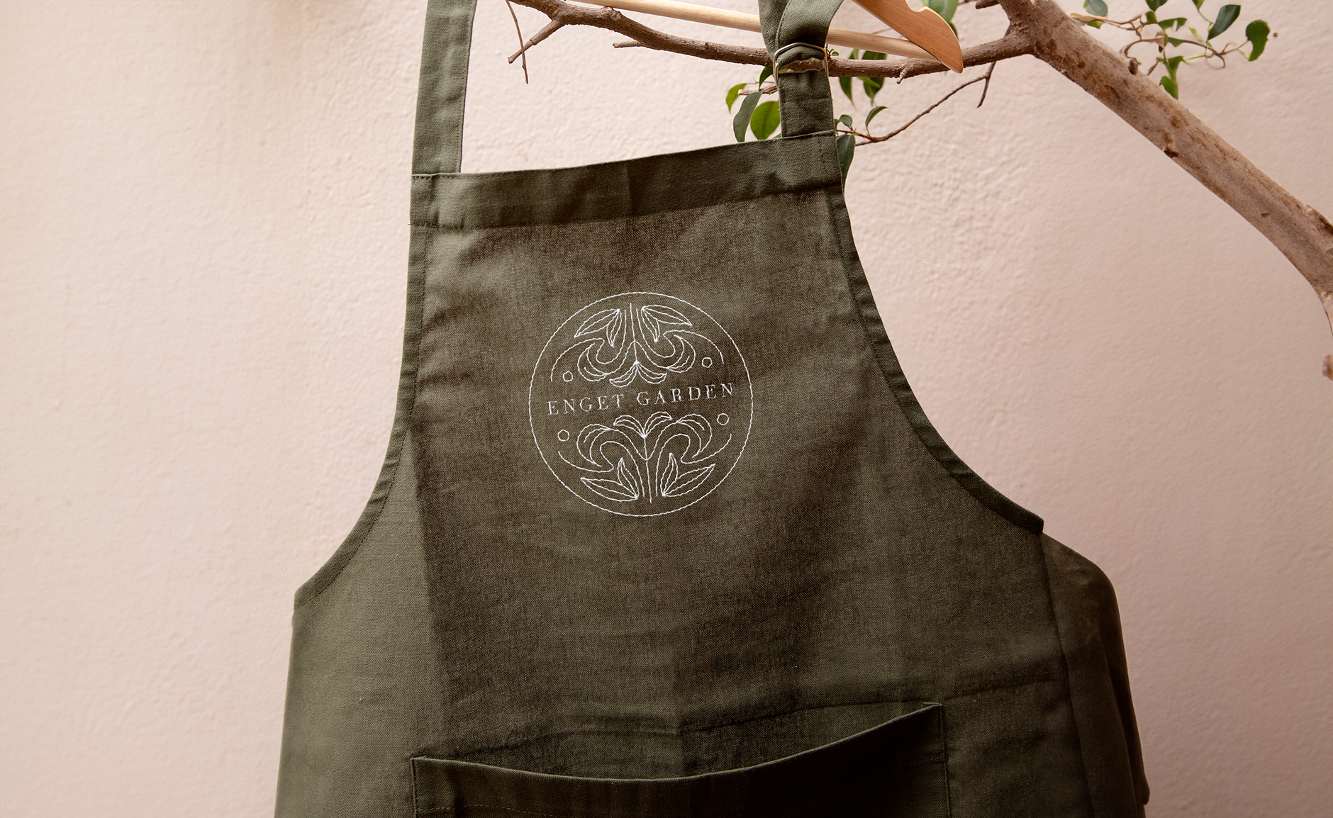
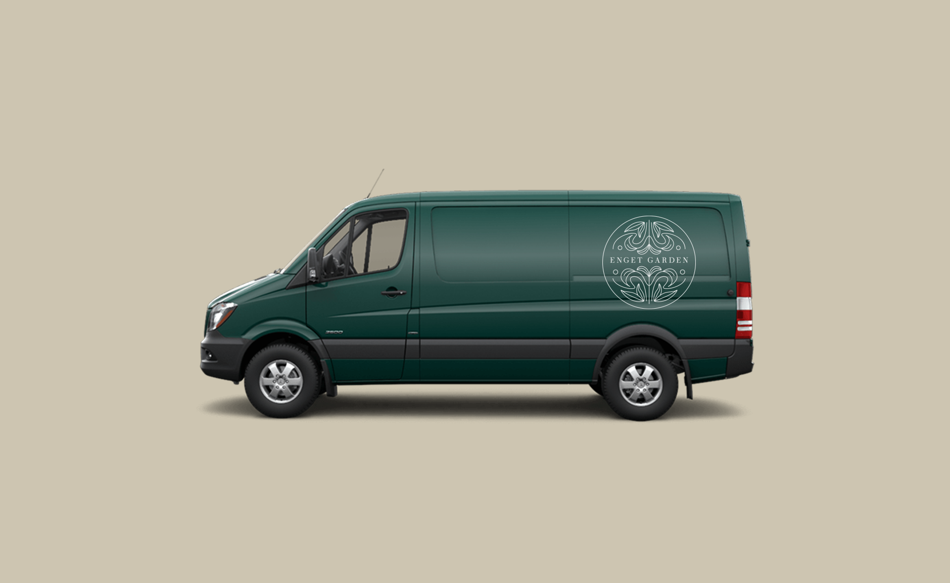
Logo, animation and colours for Enget Garden.
Enget Garden
2023
2023