Rebranding of female intimate care brand
Feminelle, under Oriflame. Updated design, labels, logo, bottle & expression.
Feminelle: Where Confidence Meets Care
Feminelle is a well-established intimate care brand under Oriflame. Moving the brand into 2025, I was commissioned as a creative lead and designer to find a suitable strategic place for the brand visually.
The goal was to educate and destigmatize intimate care, especially in conservative regions, by highlighting the products’ ingredients and functionality in a contemporary way, without causing shame or need to hide the products.
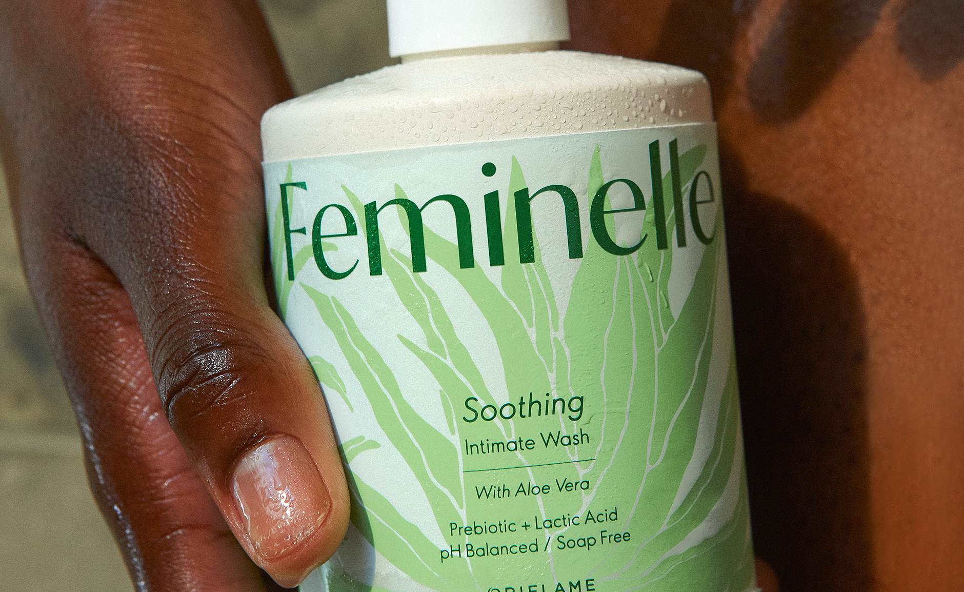
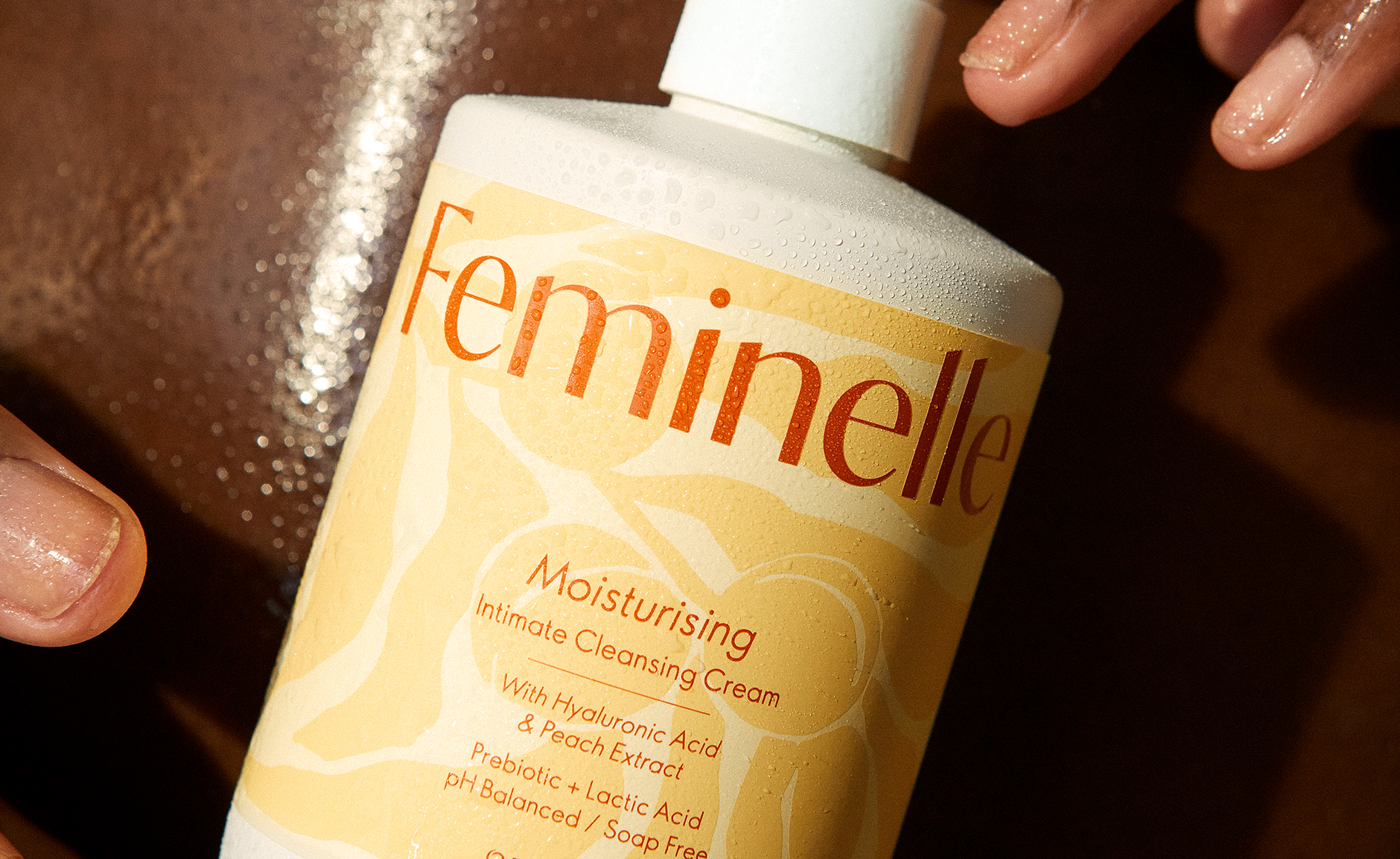
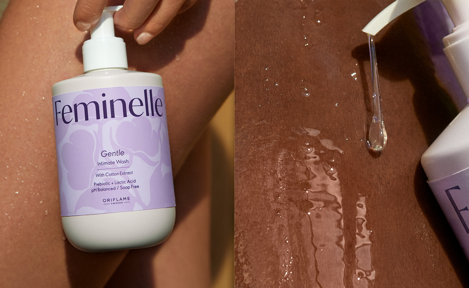
The previous bottle has been replaced with a new, current shape that communicates a kind, soft and clean approach. Inspired by the female body, it has a rounded and soft shape with proud shoulders, combining strength and grace.
Applied in a warmer white, it communicates the cleanness of the products but not as harsh as the usage of clinical white.
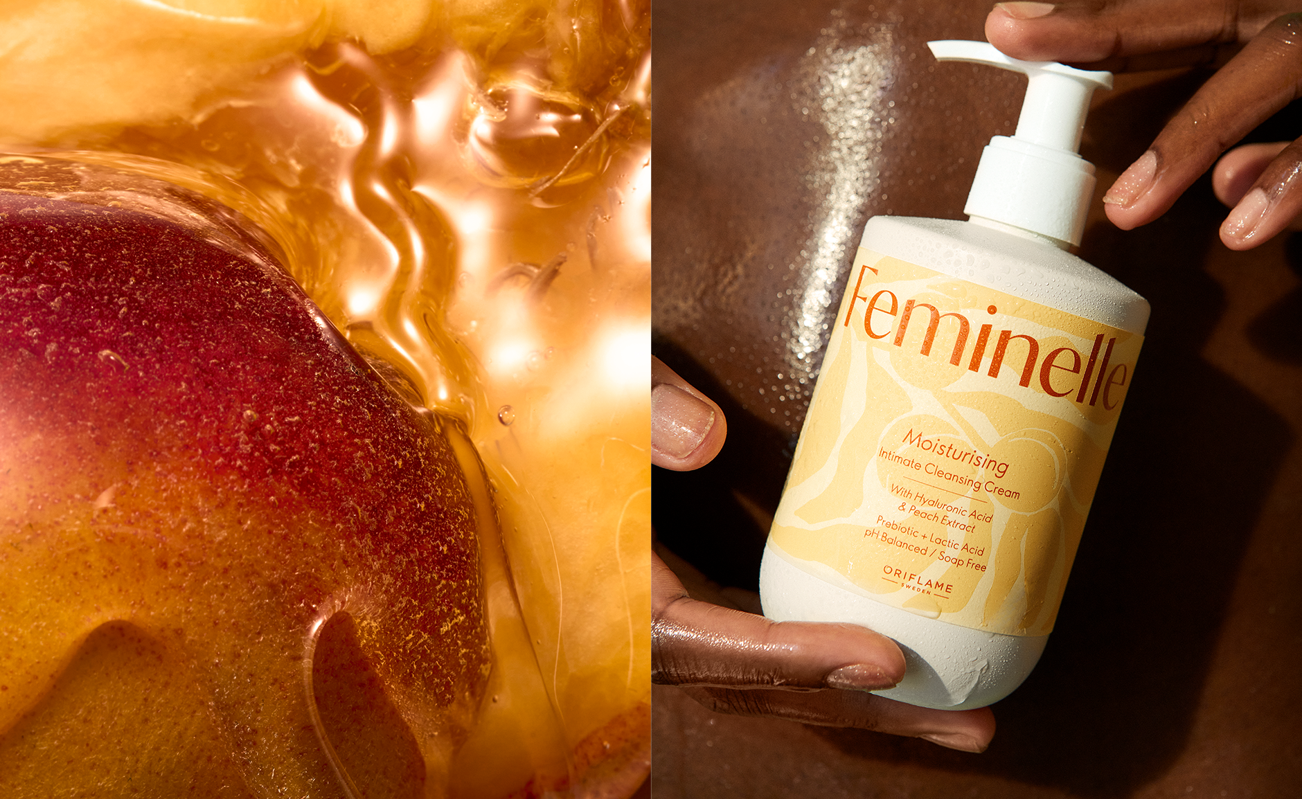
The labels feature a velvety texture with hand-drawn, modern ingredient patterns, adding a caring touch. This redesign transforms the ingredients from a graphic, stale look to an artistic display, making the products something to proudly show off, free from taboo.
The logo was reimagined to reflect the brand’s new direction. The previous romantic, traditional design has been replaced with a contemporary logo that exudes confidence and clarity, while retaining rounded shapes in the typography for added warmth.
This new logo balances modernity with approachability, positioning Feminelle as a brand that fosters confidence and openness.
Feminelle: Where Confidence Meets Care
Feminelle is a well-established intimate care brand under Oriflame. Moving the brand into 2025, I was commissioned as a creative lead and designer to find a suitable strategic place for the brand visually.
The goal was to educate and destigmatize intimate care, especially in conservative regions, by highlighting the products’ ingredients and functionality in a contemporary way, without causing shame or need to hide the products.
The previous bottle has been replaced with a new, current shape that communicates a kind, soft and clean approach. Inspired by the female body, it has a rounded and soft shape with proud shoulders, combining strength and grace.
Applied in a warmer white, it communicates the cleanness of the products but not as harsh as the usage of clinical white.
The labels feature a velvety texture with hand-drawn, modern ingredient patterns, adding a caring touch. This redesign transforms the ingredients from a graphic, stale look to an artistic display, making the products something to proudly show off, free from taboo.
The logo was reimagined to reflect the brand’s new direction. The previous romantic, traditional design has been replaced with a contemporary logo that exudes confidence and clarity, while retaining rounded shapes in the typography for added warmth.
This new logo balances modernity with approachability, positioning Feminelle as a brand that fosters confidence and openness.
Feminelle
2025
2025